1 min read
The Branding Standard For ATM Screens
Have you ever noticed those pretty images on the screen of the ATM you are using? Whether you work for the bank or are a customer, I think we can all...
2 min read
 Sean Farrell
:
Updated on May 8, 2019


I recently had lunch at one of my favorite lunch spots, Panera Bread, and this particular location was a pilot for placing orders via the new self service touchscreen kiosks. I noted a long line for the traditional cashiers and no line at the kiosk. I was sold on using the new system. After just a few moments, and one mistake or two, I had my order in and was sitting at a table with the electronic table finder.
I understand that not everyone enjoys this particular implementation, but I was impressed by the ease of use and engaging design. Whenever I go back to that Panera location, I use the kiosks if an associate is not immediately available to take my order.
The experience with the Panera kiosk helped me articulate something that had previously been difficult to put into words--that people enjoy their experience more when paired with well designed, eye pleasing interfaces. I can certainly understand the perspective of a banking officer who has approved the purchase of a new ATM, but after the unit is installed, is left with a flat or un-inspired feeling upon using it. With so many interfaces available to us--smart phones and tablets, self service kiosks (like Panera), vehicle dashboards and countless others--having an ATM interaction that feels like you are playing tic-tac-toe with JOSHUA from War Games simply doesn’t fit. Was Matthew Broderick in 1983 too far back to go?
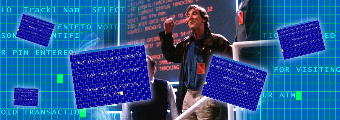
After hearing similar results from our valued clients, we sought to change such outdated screens by offering custom designed graphics and branding packages. Once deployed, every ATM screen evolves from a generic blue background with yellow text to a beautiful, branded experience, giving the transactions a completely different look and feel. While performing these updates onsite, I've heard the terms "quality, high-end, easy, beautiful, sleek, streamlined and impressive" to describe the new ATM experience.
I think the best part of the process is the discovery session that is completed before the development even begins. We talk to the folks in charge of marketing the brand and determine what the main goals of the interface should be, as well as ensuring that the ATM screens reflect what the financial institution may be working on with their print, web and mobile marketing platforms.
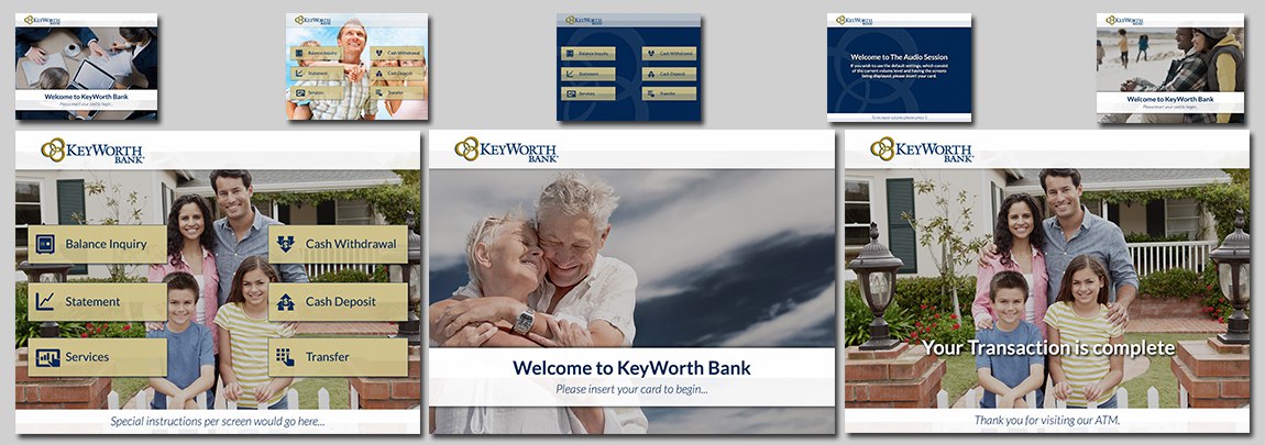
Once installed on the ATM--about 30 days after we begin--the customization completely transforms the user experience to one that better reflects the bank or credit union brand image. The basic operation of using the touchscreen becomes less frustrating as well, placing nice large buttons where confusing dashed arrows once lived. If you've just realized your graphics may need an overhaul, drop us a line and ask for some samples. We would be thrilled to see if custom graphics suit your goals.
1 min read
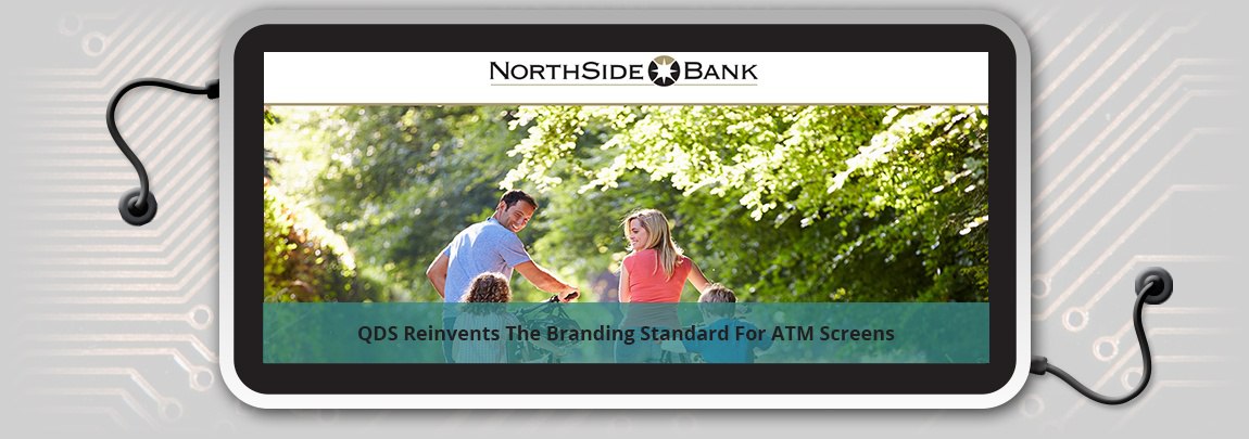
Have you ever noticed those pretty images on the screen of the ATM you are using? Whether you work for the bank or are a customer, I think we can all...
Let’s face it, managing ATMs can be challenging. It’s tough keeping up with repairs, technology advancements, and compliance, all while trying to...
As humans, many times we look at electronics as being invincible. For example, we have the six Million-Dollar Man, the Terminator and even your handy...